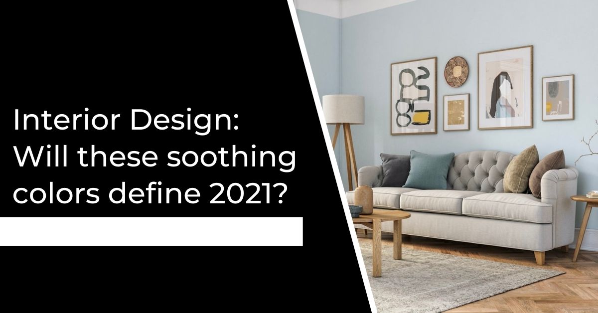
Interior Design: Will these soothing colors define 2021?
It’s a good time in the home design world to check out paint brands’ picks for 2021 Color — or Colors — of the Year.
Pantone recently unveiled its selection, a sunny yellow and mid-gray duo, so let’s see what other colors we might see more of in the coming year.
Aegean Teal From Benjamin Moore
Soft and soothing Aegean Teal is Benjamin Moore’s Color of the Year and one of 12 hues selected for its 2021 trends palette. All the colors in the palette are inspired by nature and are meant to convey warmth and well-being.
This color comes highly recommended for the interiors and exteriors of many clients’ homes. It’s a fresh take on a neutral, colorful without being too bright, and saturated without being too heavy. It’s equally at home on interior walls as it is on exterior siding. In a kitchen, it’s a softer alternative to popular navy blue for cabinetry.
Urbane Bronze From Sherwin-Williams
Here’s another go-to hue in the arsenal. Urbane Bronze is a rich and elegant hybrid of brown and dark gray, of dark wood and metal tones. It’s the ultimate earth tone. It’s also solid and comforting, a terrific accent or trim color that can be paired with warm or cool hues. When it’s combined with plenty of warm whites, as shown in this bedroom, the result is dramatic yet soothing.
Passionate From HGTV Home by Sherwin-Williams
This juicy hue is one of 10 colors in HGTV Home by Sherwin-Williams’ 2021 Color Collection of the Year. Passionate was picked as the top-trending hue of the bunch for its warm and welcoming ways. Red tends to stimulate our hearts, minds and appetites, so this red wine hue is good for a dining room, living room, office or any other space where animated conversations tend to occur.
Earth’s Harmony From Dutch Boy
Chosen to evoke clear blue skies on a beautiful day, Earth’s Harmony is Dutch Boy’s pick for 2021. A pure bright blue that helps bring the feeling of the outdoors in, it could be a welcoming option for those sheltering in place with winter weather bearing down.
Nine additional colors round out the company’s 2021 trends palette, which is equal parts bold, fresh and soothing.
Aqua Fiesta From Glidden
Taking a slightly different approach from other paint brands, Glidden has named an Accent Color of the Year for 2021, and it’s a vibrant aquamarine. Neutrals stand the test of time better than bold accent colors, it’s a great idea to focus on the latter when promoting trendy hues.
Use Aqua Fiesta to play up interesting architectural elements, as was done with the wainscoting in this room, or put it on the front door for a splash of tropical blue as a greeting hue.
Transcend, Big Cypress and Misty Aqua From PPG Paints
PPG Paints also went in a different direction this year by choosing not just one but three colors, comprising its 2021 Paint Color Palette of the Year.
Transcend is a warm latte color that serves as the main, neutral backdrop to bolder Big Cypress, a saturated terra cotta, and Misty Aqua, a watery blue. The palette evokes a trip to the seashore with the combined colors of the sea, sand and coral.
2021 Color Trend Stories From Dunn-Edwards Paints
Dunn-Edwards Paints chose a whopping 60 colors, broken down into five distinct palettes with 12 colors apiece. Shown here is a selection from Lagom, which is a Swedish term for the virtue of moderation and balance. It’s a nature-inspired palette that features soft mineral hues with a sprinkling of more saturated colors.
You can see Silver Creek or Dolphin Tales used as a neutral base for the more striking Navajo Turquoise and Growth.
Color Trends 2021 From Behr
Behr is ushering in 21 colors for 2021. They’re a mix of warm and cool hues, and most are quite rich and saturated.
Shown here is a sampling of Behr’s selections: Voyage on the ceiling, Smoky White on the walls and Broadway on the window frame.
This illustrates one of my favorite and unexpected ways to use a vibrant or saturated color: on the ceiling. It really pulls you into a room by drawing the eye up and, if the vibrant color is paired with a light neutral on the walls, gives a space a fun, colorful look without feeling heavy or overwhelming.
2021 Colors of the Year From Valspar
Valspar also chose a nearly equal mix of warm and cool hues, but its 12 picks are slightly more muted than Behr’s.
One of Valspar’s selections, Lucy Blue, adorns the wall in this elegant living room. Blue hues are a top pick for spaces with rich wood tones if you want the wood to really stand out. Because blue and brown are opposite on the color wheel, each amplifies the other. The contrast is striking, but because Lucy Blue contains a good bit of gray, it doesn’t overpower the beautiful wood tones. Balance really seems to be key for 2021.

